Role
Product design — Interaction design, Visual design, User flows, User testing, Rapid prototyping
Timeline
3 months
Historically, Zocdoc's pages were optimized mainly for conversion, likely compromising SEO. Provider and practice profiles were developed in isolation, leading to weak connections and a lack of shared insights.
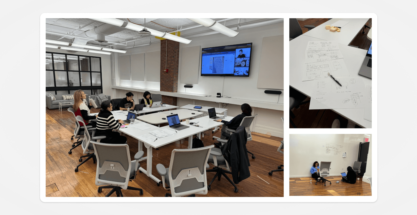
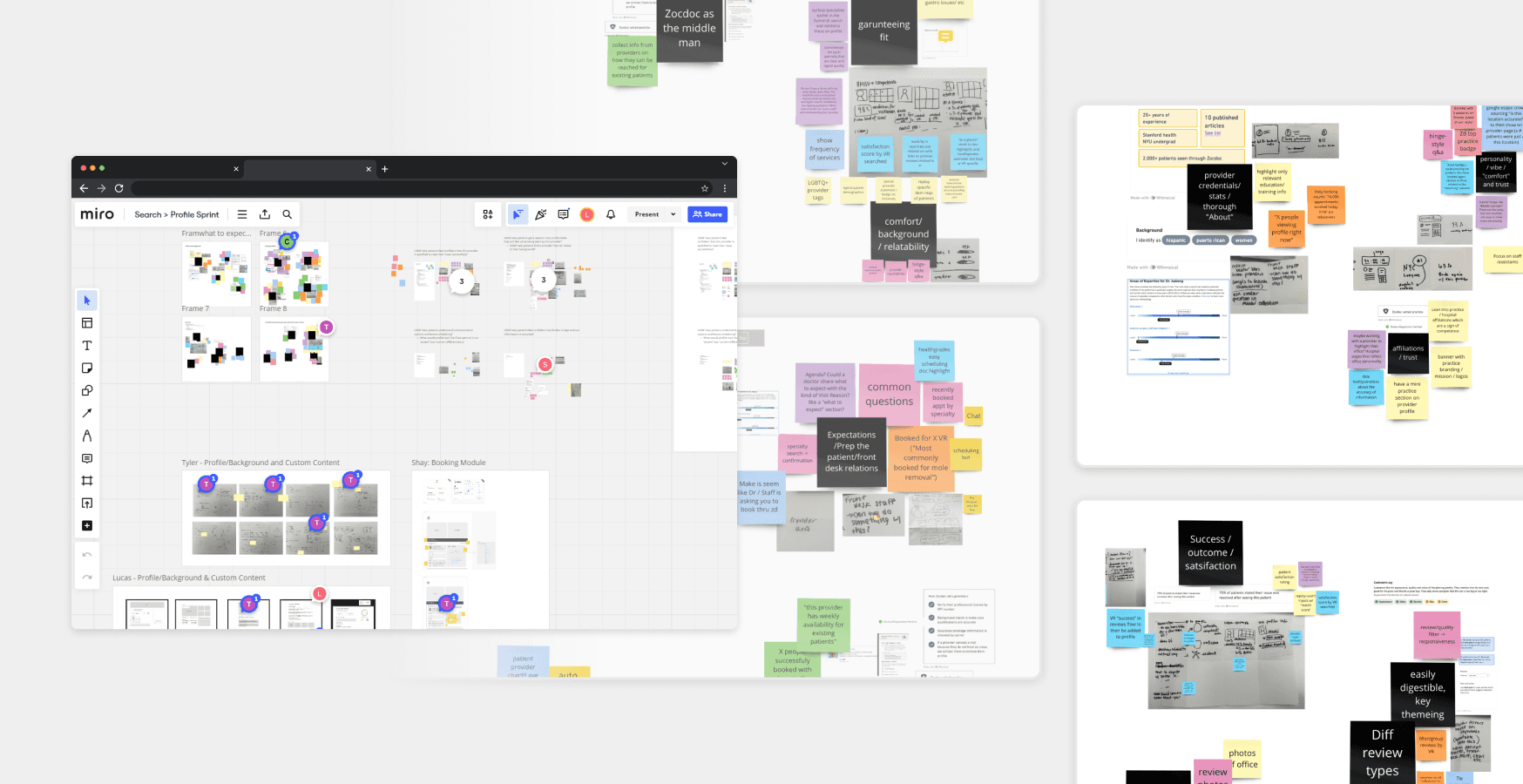
To address these issues, we initiated a multi-week design sprint, starting with an onsite workshop involving the design team, user experience researchers, and key stakeholders. We brainstormed big-swing ideas and created initial wireframes. A smaller team, consisting of myself, one other designer and a user researcher, then continued the sprint with multiple iterations, user testing, and feedback from stakeholders and leadership.
The result was a complete redesign of the backbone system for our profile pages, aimed at improving SEO, user experience, and profile integration. This additionally set a new standard for Zocdoc's product quality. The new design is currently in development.
Challenge
The siloed design approach has led to a significant portion of traffic (~65% from doctor SEO) encountering dead-end experiences, which has negatively impacted conversion rates.
Despite having extensive insights into patients' search motivations—such as ratings and reviews, insurance, location, and availability—the current system has hindered Zocdoc's ability to quickly and efficiently introduce new care types.
Opportunities
Some product opportunities surfaced that demanded our attention and action.
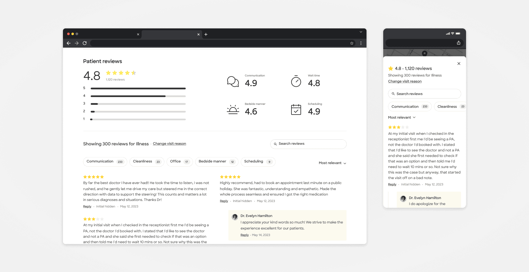
Improve patients’ ability to assess fit by adding more quality signals to provider profiles
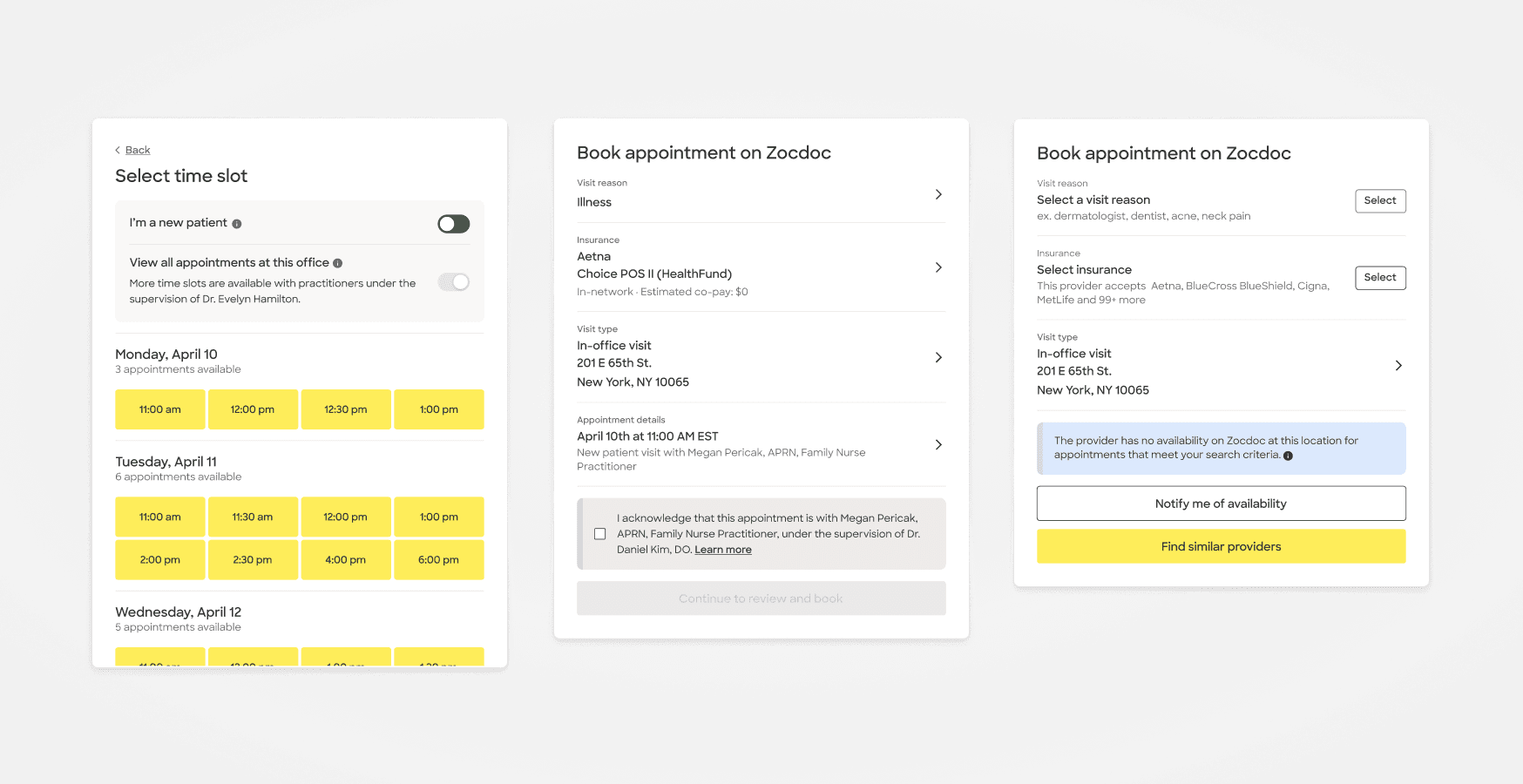
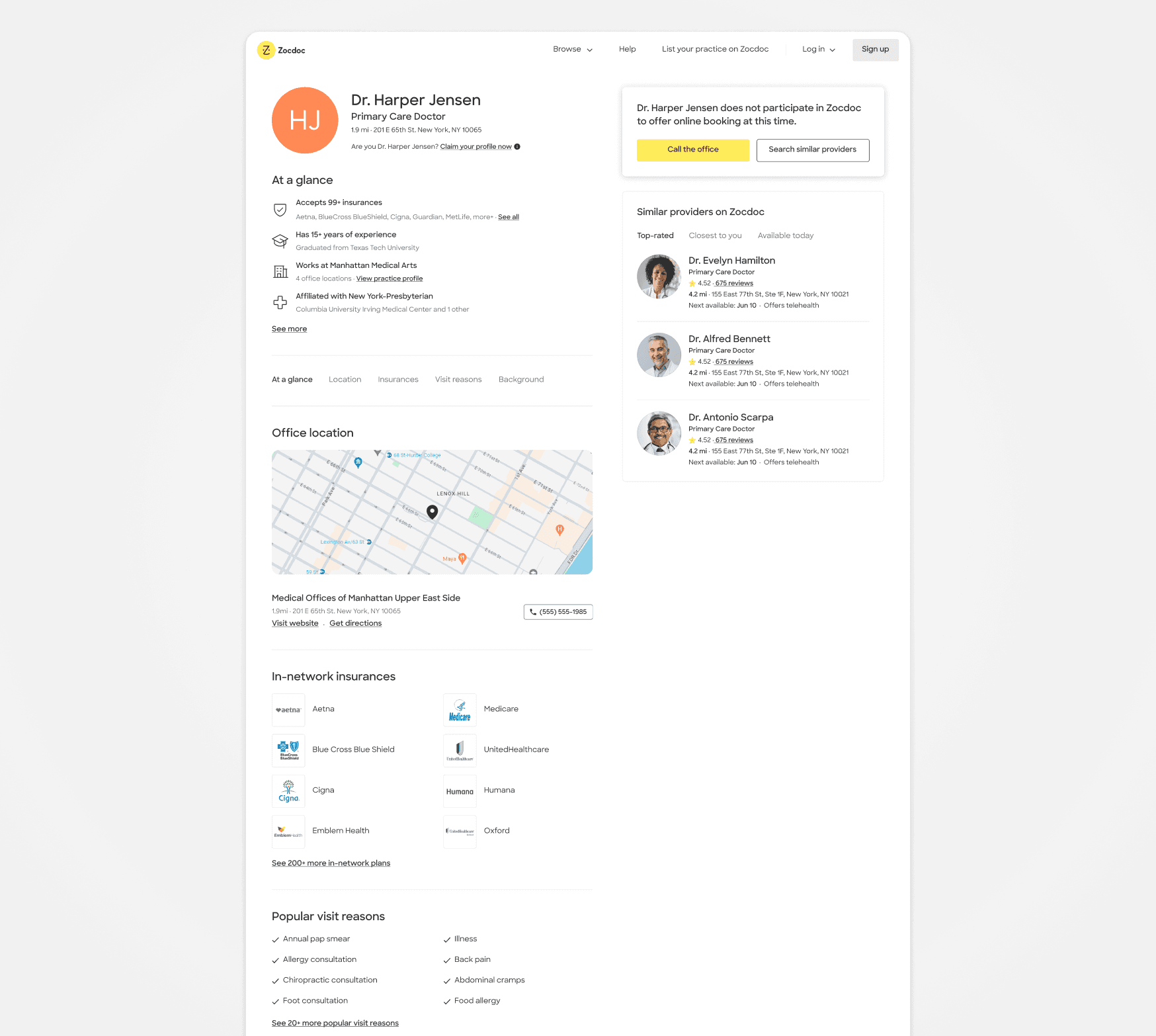
Improve dead-end experiences (active providers no availability, churned provider profiles)
Refactor information architecture of the profile page
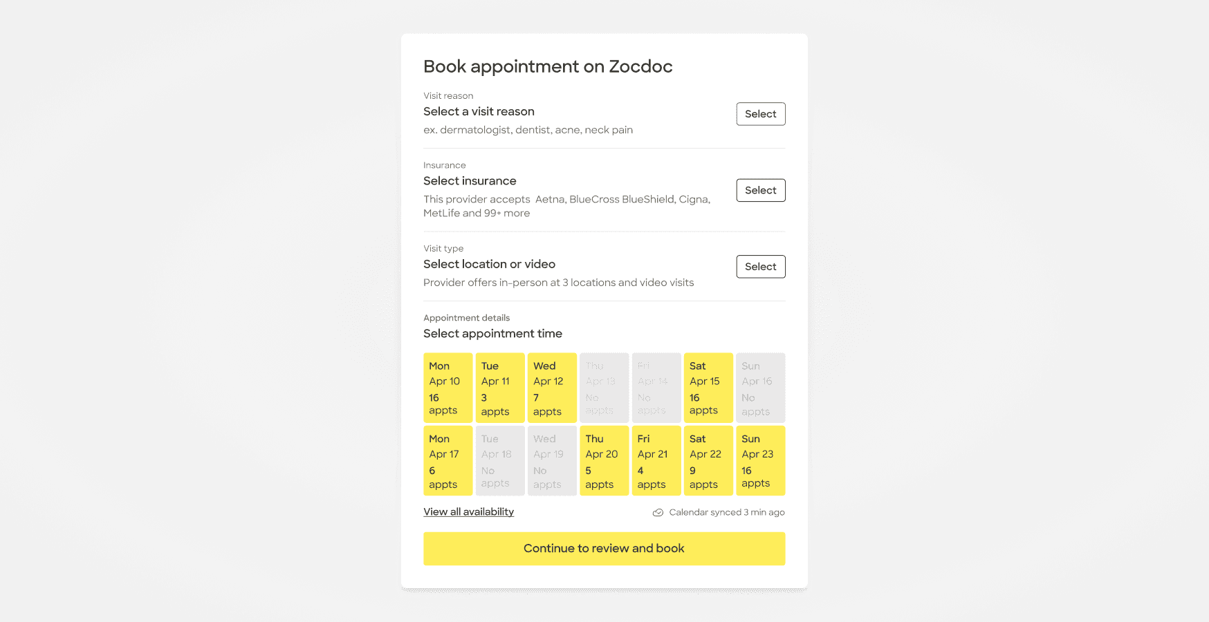
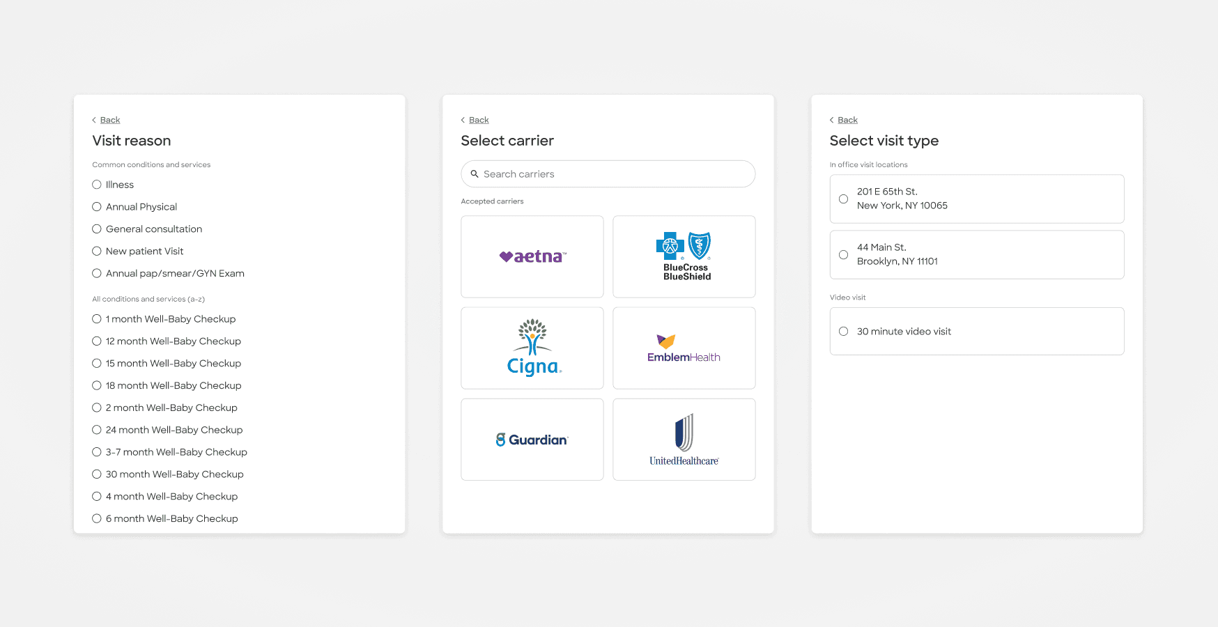
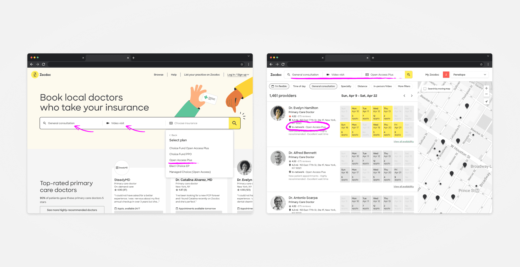
Continuing to build on up-funnel qualification to ensure users select a timeslot that fits their criteria
Objectives
Establish a framework/mental model of user needs for the profile page.
Comprehend how individuals utilize profile pages to guide their choices.
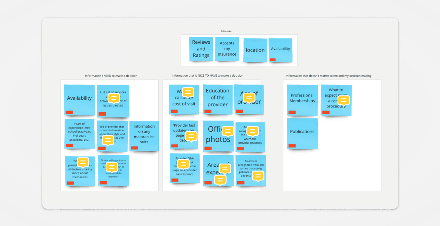
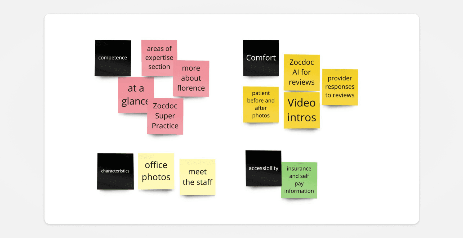
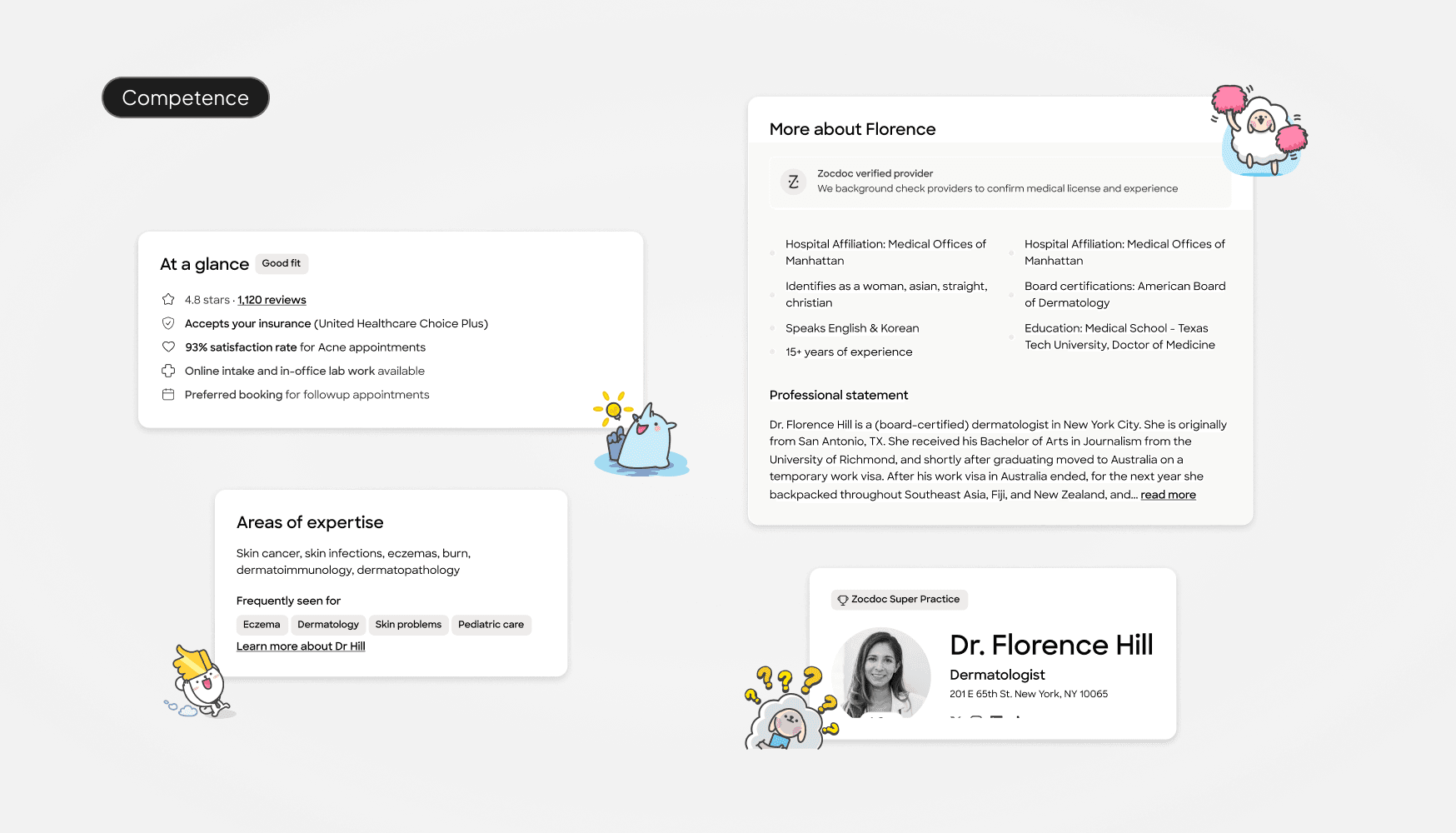
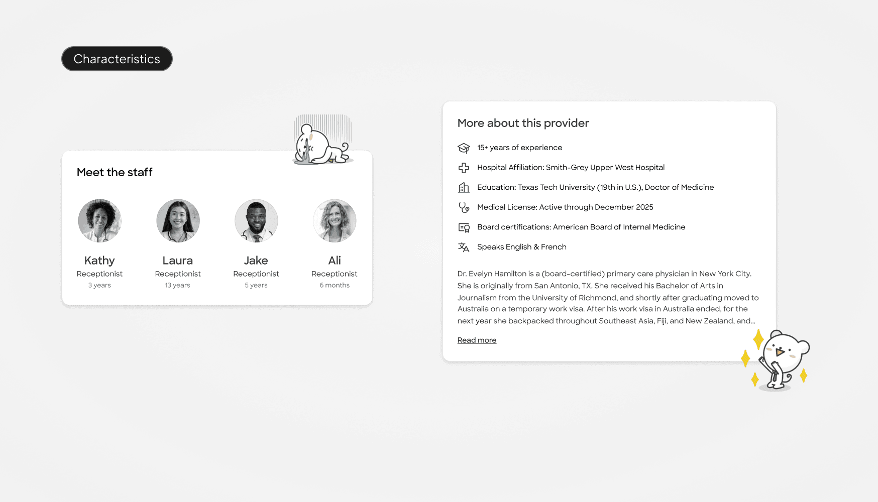
Competence
Qualifications, years of experience, area of expertise
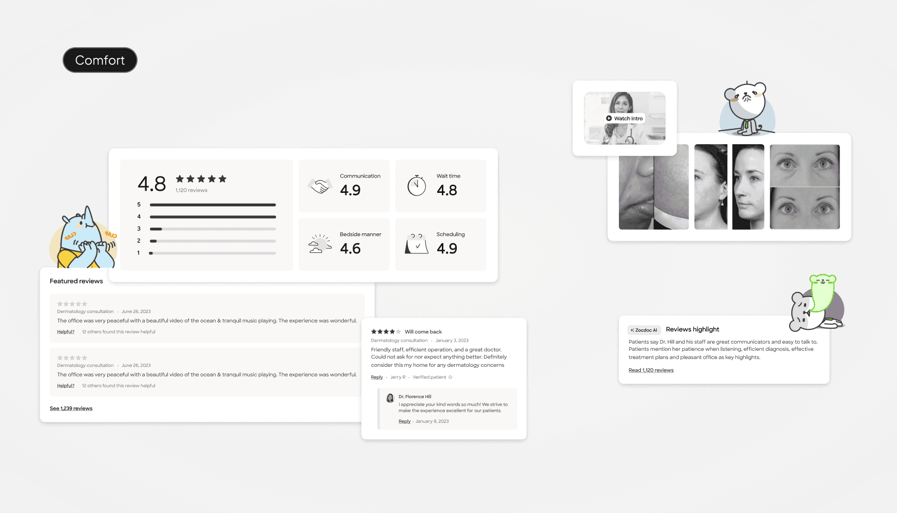
Comfort
Bedside manner, ratings, reviews
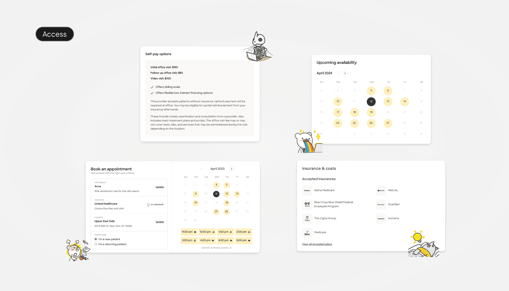
Access
Scheduling, communications, availability
Characteristics
Features to identify, photos
Ideation
The four pillars/criteria gave research, product, and design a framework for tackling new concepts and components for the profile page and as such, the concepts that were put forth in testing were made to clearly map back to these criteria.
The kickoff was a weeks worth of collaboration with several stakeholders across product and design. We got together to think more deeply about the research and go through a series of exercises and "how-might-we's" to bring those research pillars to life.
Our ideation process produced numerous examples, all guided by our research framework as our north star. Every concept we developed consistently aligned with the four key pillars of comfort, competence, access, and characteristics. We agreed on testing several key ideas that adhered to these fundamental principles.
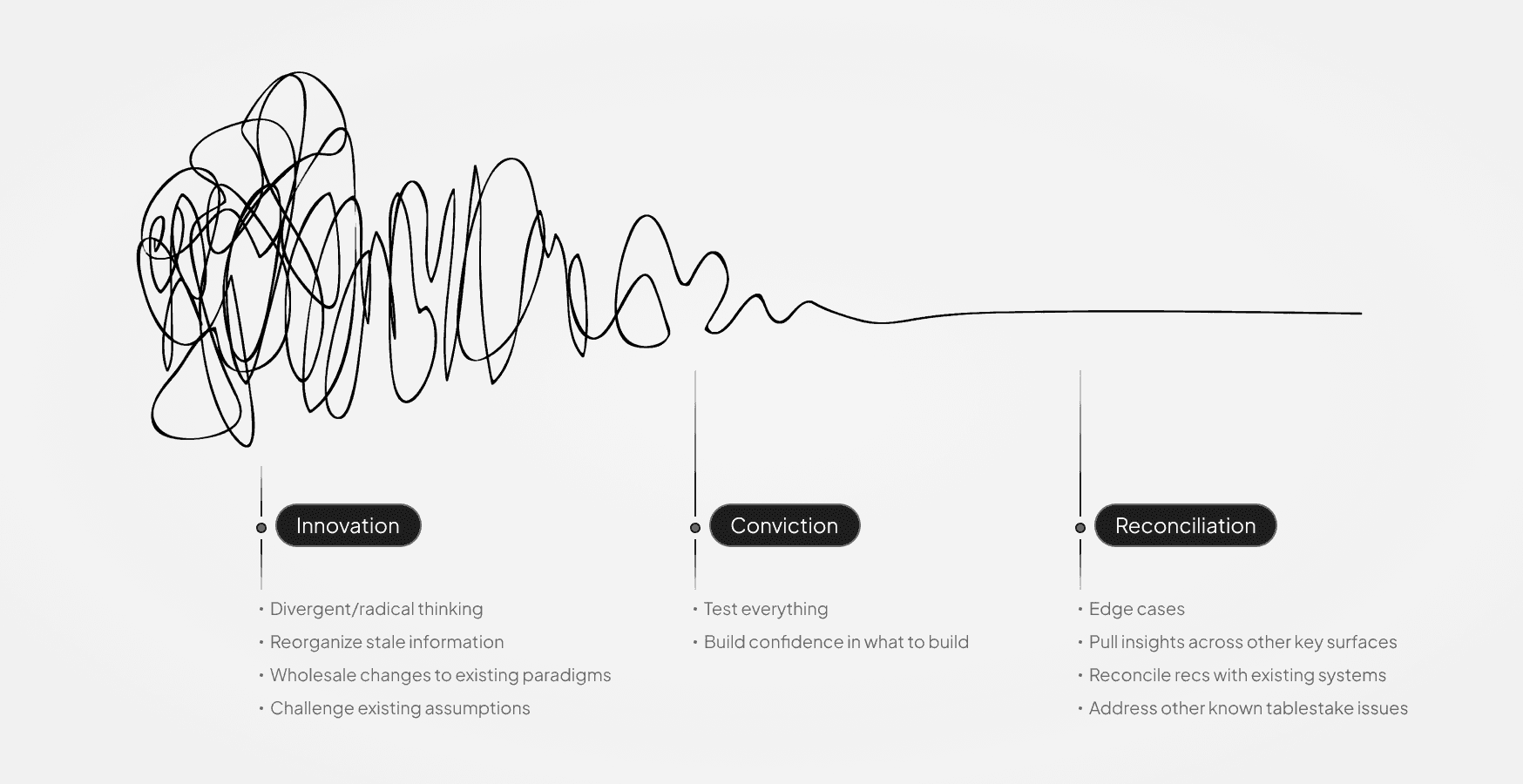
Concepting
After selecting several key concepts to explore, we transitioned from ideation to execution by translating these ideas into wireframes. The wireframes served as visual blueprints that encapsulated our strategic vision. This process allowed us to concretize our ideas, providing a clear and tangible foundation for testing. For the first round, we developed two distinctly different versions of the same page, each incorporating various content modules we intended to test.
Testing
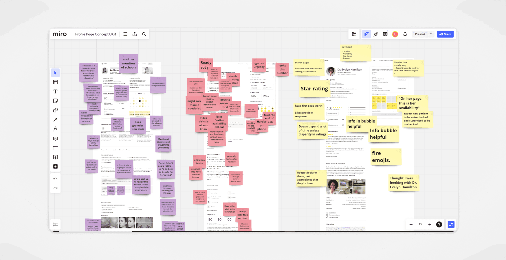
We received invaluable user feedback for each concept, gaining deep insights into users' thoughts and expectations for these pages. Some elements were highly successful, while others fell short and caused unnecessary confusion.
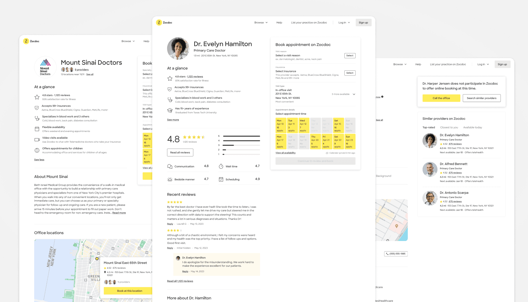
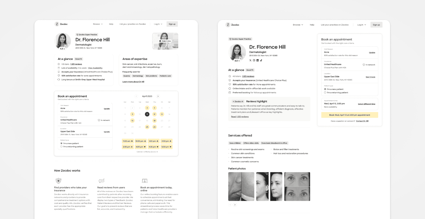
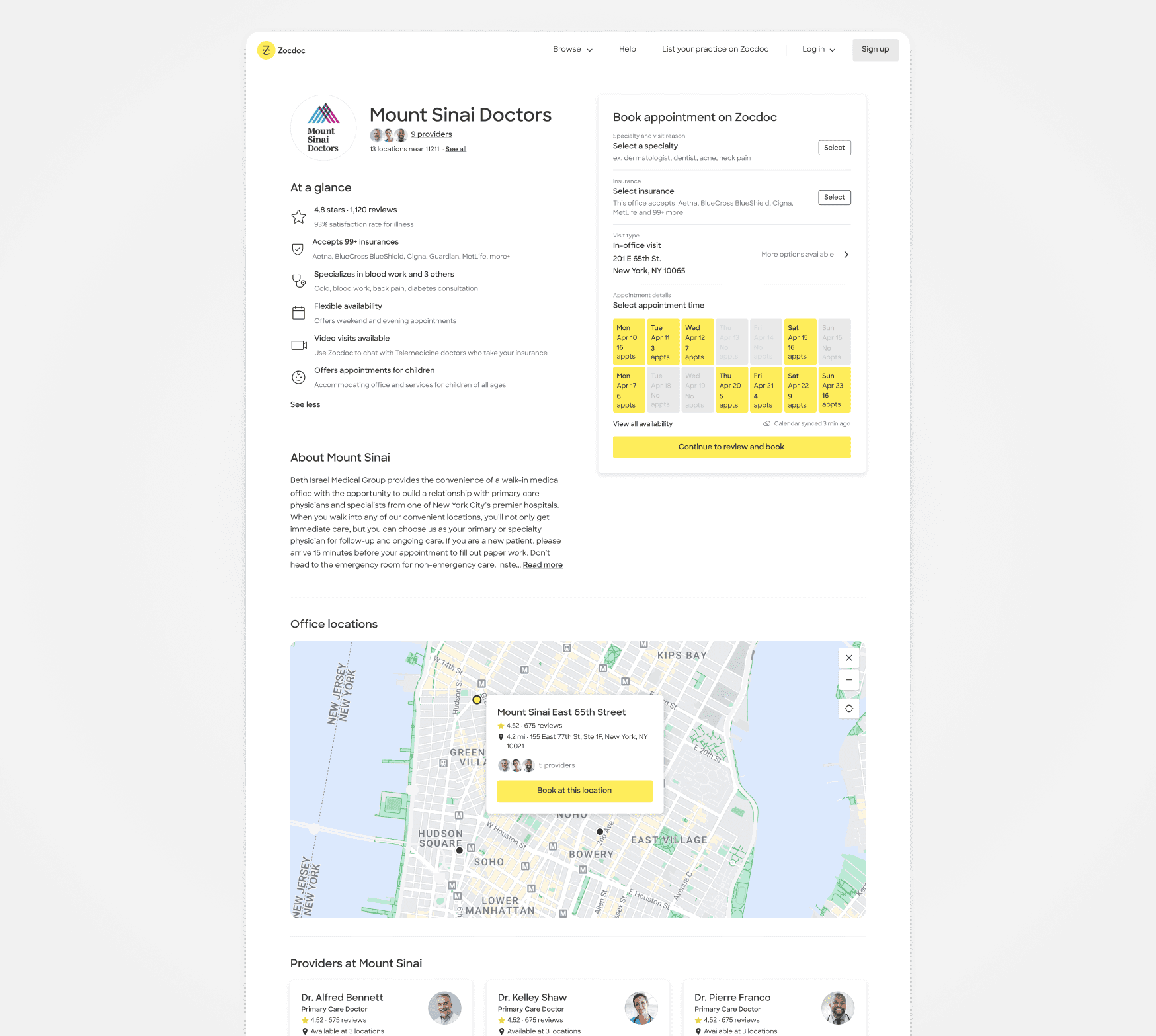
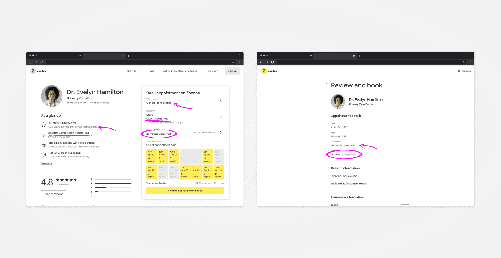
Final designs
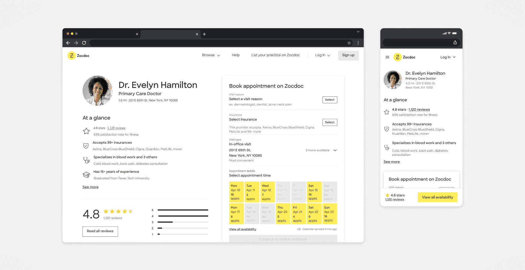
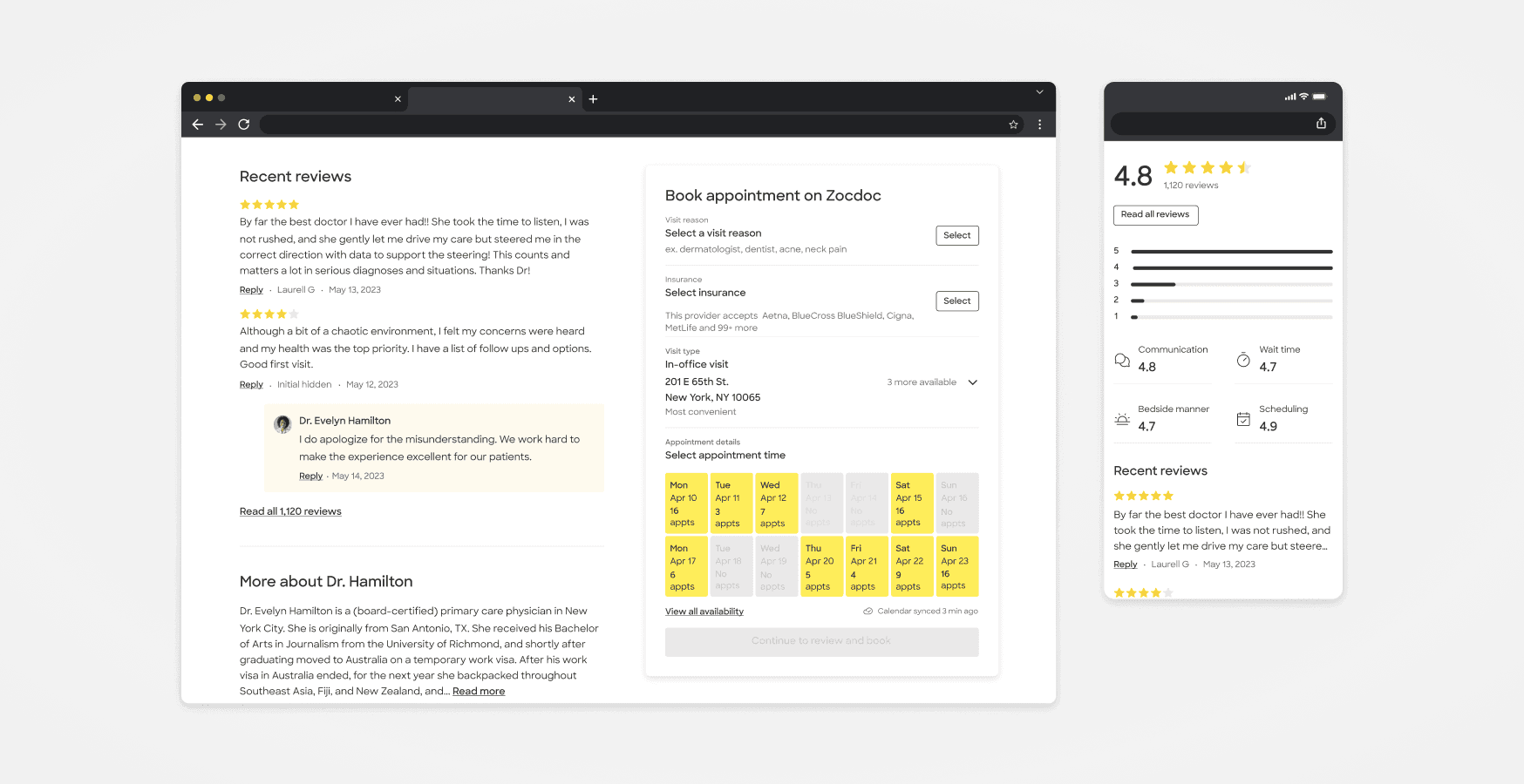
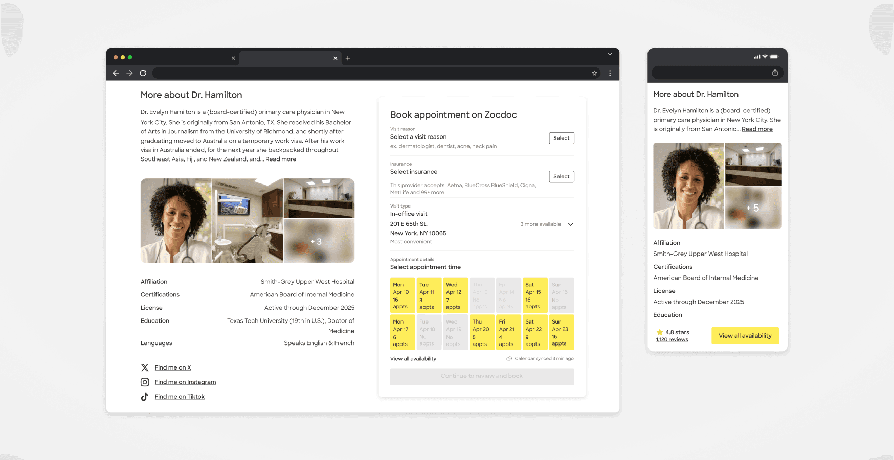

As stated before, the previous system hinders the ability to swiftly launch new care types and affects our overall speed in iteration and testing.
With this redesign, we focused on addressing patient pain points and creating a scalable system for adding new care types, enhancing patient value.
An instrumental component is the booking module, which required extensive technical planning to accommodate every use case. We designed it to offer a more user-friendly flow for information inputs.
Adopting this systematic design approach enables us to establish a strong foundation for adjacent pages. We can efficiently reuse and refactor components according to specific page requirements, ensuring scalability for future products.
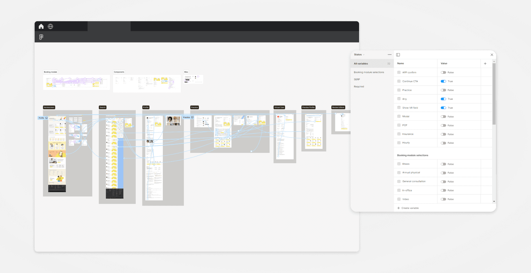
I aimed to enhance participants' experiences by pushing prototype boundaries. Our traditional use of prototypes often constrain interactions to linear flows, leading to minimal interactivity. By capturing and storing user inputs throughout sessions, I was able to create a more personalized experience. This eliminated prototype "dead-ends", enabling higher fidelity learnings and earlier identification of usability issues.
Results
The North Star designs have been phased out and are currently in development. Numbers aside, this new initiative has significantly elevated Zocdoc's product quality standards. We have established a strong foundation for achieving meaningful outcomes. Due to the success of this project, an additional design sprint is now underway.