Role
Timeline
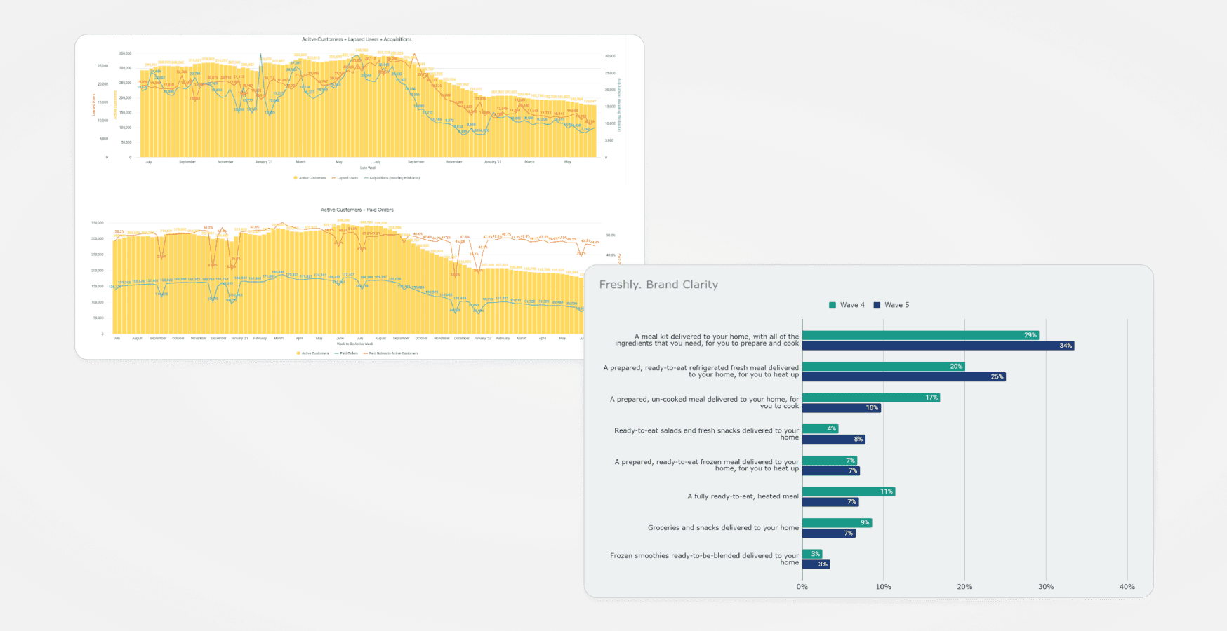
In August 2022, an Accenture assessment revealed that Freshly's site conversion rate had declined significantly, showing a 22% year-over-year decrease. To address this downturn, we embarked on a series of tests and experiments aimed at optimizing various aspects of the conversion funnel to recover and improve the site's performance.
I led the design direction of redesigning Freshly's homepage and checkout experience which improved conversion and helped strengthen brand identity.
Challenge
Brand awareness data revealed that 34% of consumers mistakenly believed Freshly was a meal kit service, creating significant confusion about the product. User research also indicated that many visitors found the homepage overwhelming, with unclear packaging information, pricing, and subscription details.
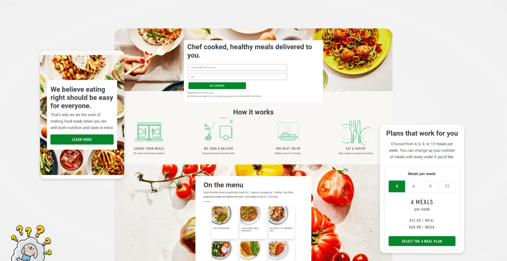
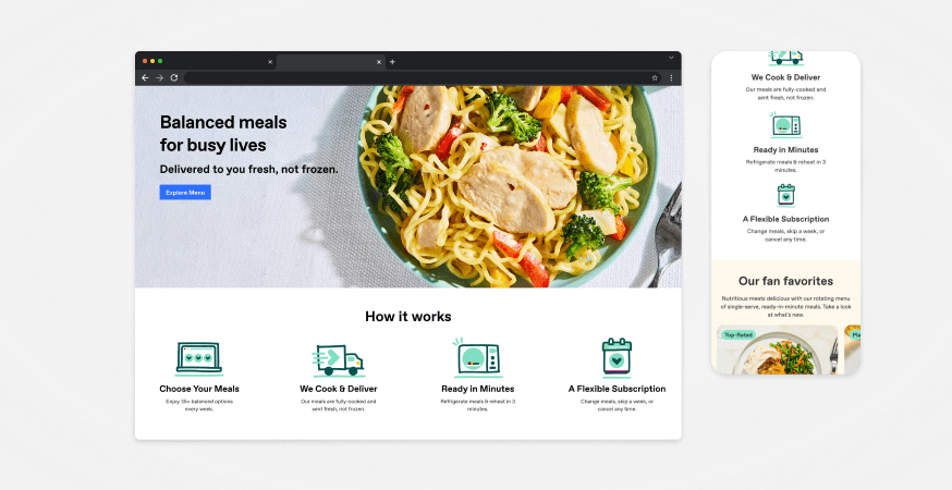
The previous homepage lacked cohesiveness, featuring repetitive copy, unnecessary elements, and insufficient pertinent information.
Objectives
Based on comprehensive data analysis and research insights, the following research objectives were established.
Identify user preferences and informational needs regarding Freshly's offerings prior to subscription commitment.
Investigate and analyze friction points within the homepage and conversion funnel to enhance user experience and streamline navigation.
Evaluate the efficacy of the current website design in facilitating conversion and explore opportunities for optimization to improve conversion rates.
Approach
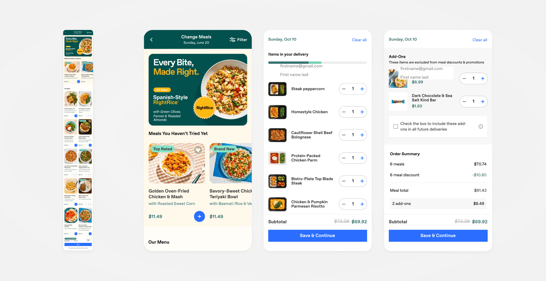
Our approach aimed to streamline the funnel flow to boost user engagement and conversion. We targeted the mobile homepage and checkout flow, where the highest drop-off occurred compared to the web, aiming to reduce this by over 3% across all stages and by 2% in the most efficient conversion paths. Additionally, we tackled the significant 50% drop-off at the meal selection stage.
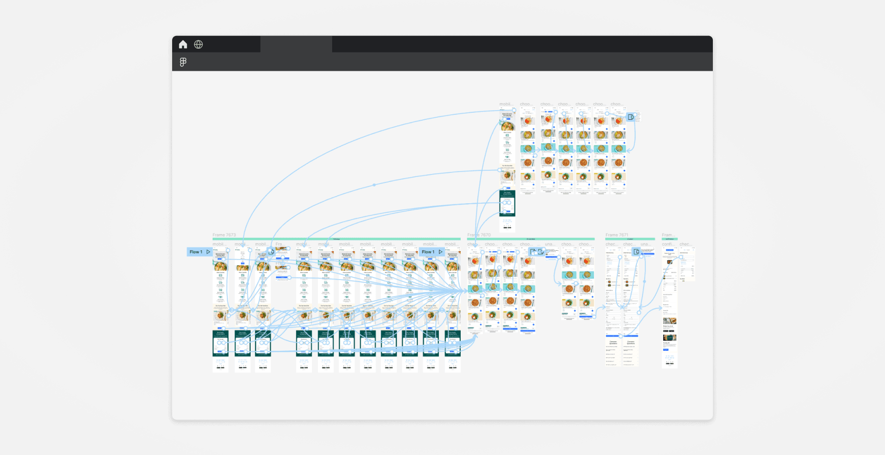
Concepting
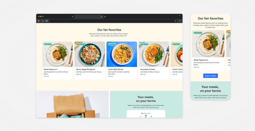
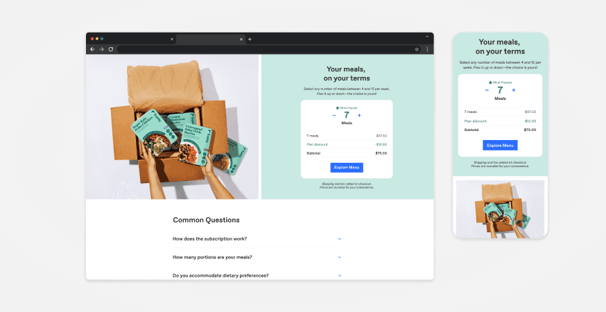
Multiple rounds of iteration were conducted to refine and systematically address friction points identified in the user experience. Through this iterative process, the final iteration successfully aligned with both my objectives and the expectations of leadership. Key enhancements included:
Reducing the overall page height to enhance user engagement and minimize drop-off rates.
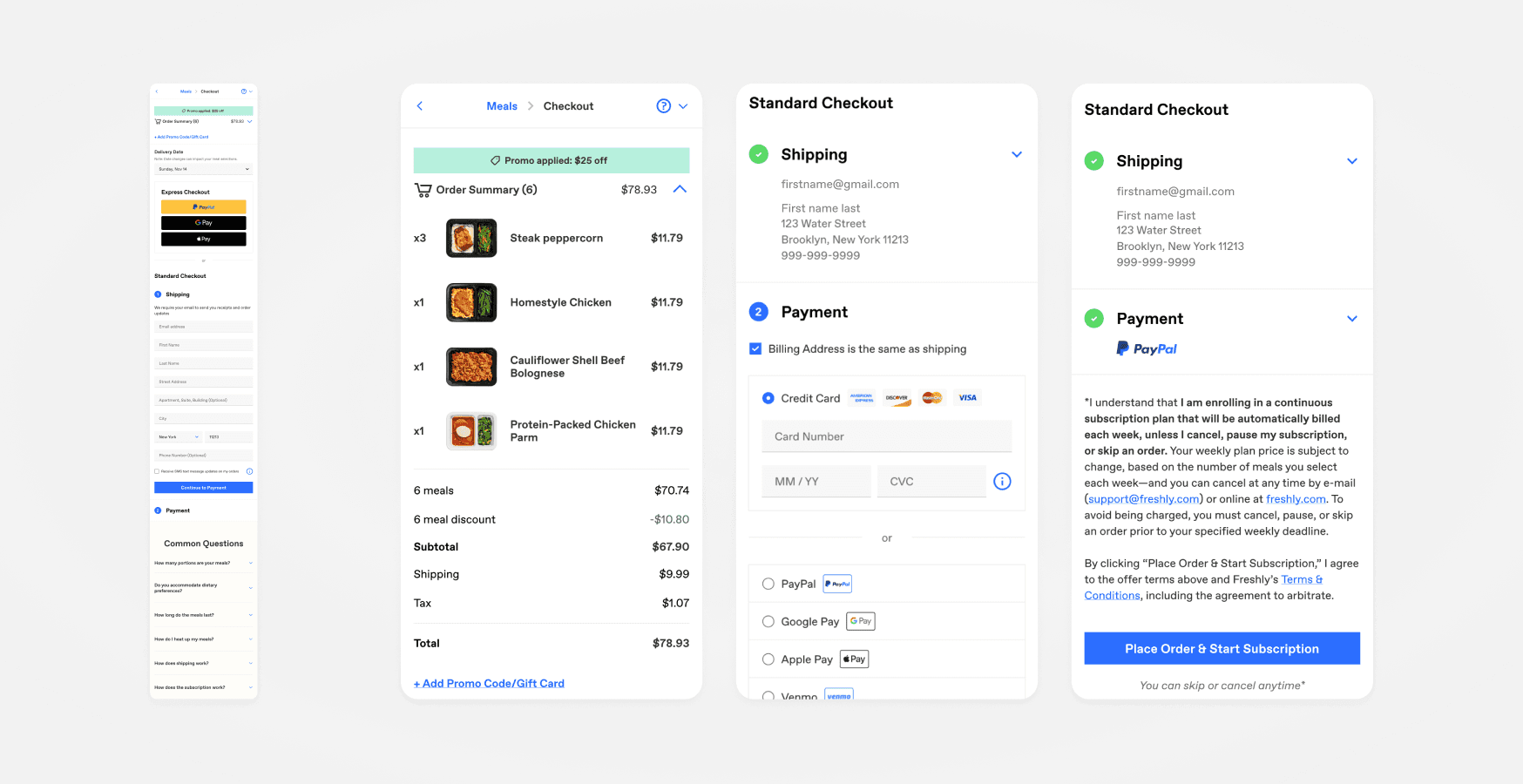
Clearly defining Freshly as a subscription service to enhance brand clarity and messaging.
Introducing a dynamic "pricing calculator" to provide transparency in Freshly's pricing model.
Implementing consistent call-to-actions to streamline user navigation and eliminate confusion.
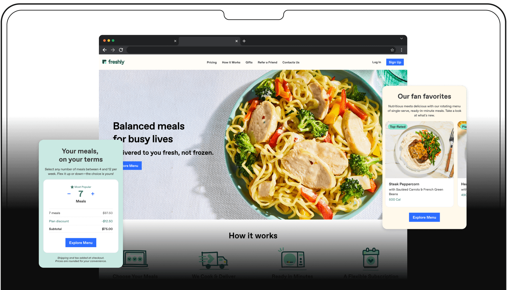
Final designs
Subsequent user testing was conducted using the updated homepage design, resulting in users demonstrating a clear understanding of Freshly's value proposition. Positive user feedback was received regarding the introduction of live pricing and readily accessible answers to common questions.
Results
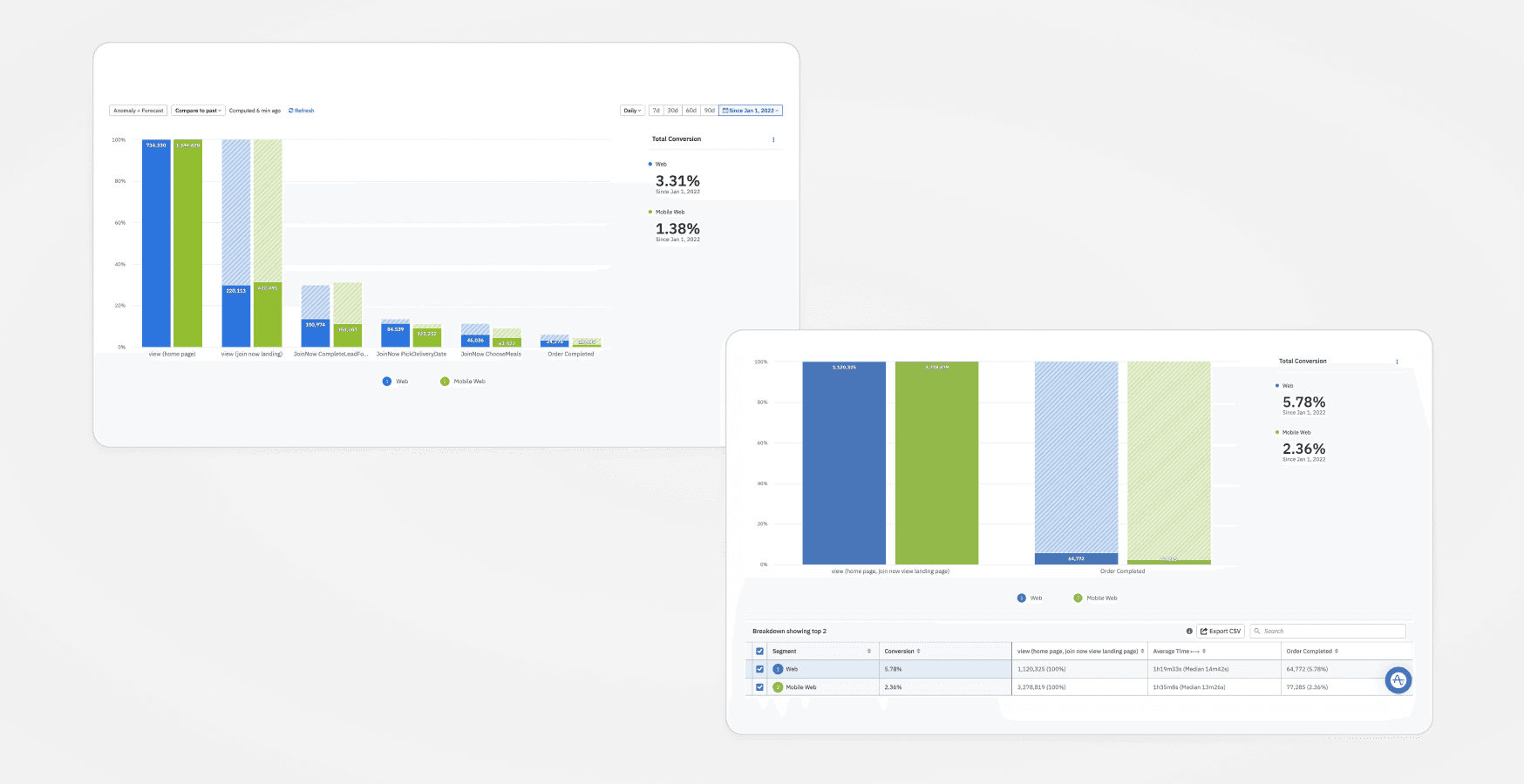
A conversion test was conducted, comparing the new variant against the baseline to track the journey of new users from homepage to order completion. The test swiftly achieved statistical significance, revealing a notable 24.1% improvement in conversion rates and a 99.6% likelihood of outperforming the baseline.
Furthermore, alongside the overall increase in conversion, a significant reduction in drop-off rates was observed among users navigating to the "choose meals" flow.